
Recently I decided to use Tintype D-Type Plate film for a series about cemetery architecture and stone work and after a number of photographs had gone through the post process, I realized how the image was being presented became an issue.
Normally all my web photographs are 590 pixels at there widest point, with an additional 10 pixels for a white border and somehow visually this was inadequate for photographs in which Tintype D-Type Plate film was employed due to its border. A solution needed to be found in order to do any justice not only for my photographs but also the Tintype D-Type Plate film, which has had great success among Hipstamatic photographers since its release.

Image 590, white border 10= 600 x 600 pixels
Discovering a combination with the right visual effect soon became a challenge and before too long I had nine different versions, with most being acceptable, but which one is right.
During the discovery process it also became apparent that I would need to resolve how the photographs would be presented in book form, including as a print, which is ultimately framed.
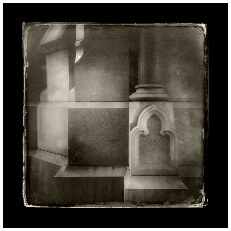
The actual photograph being used to test the various frame combinations also became an issue, further complicating matters on which set to settle upon, except for one fact, it was imperative to have a black background, even for exhibition print and book form. Undeterred I moved forward upon my quest.

Image 600, black border 350, white border 50= 1000 x 1000 pixels
Even though flawed, I starting with the one which was preferred from the start, for I liked the proportions between the black area and that of the photograph. In this example (shown above) the photograph is given dignity and an air of importance. Especially when considering the purpose of using Tintype D-Type Plate film for this project, is to emulate that these photographs were taken during the time when many of the mausoleum and crypts from 1870 to 1930 were build.

Image 660, black border 40, grey strip 10, white border 290= 1000 x 1000 pixels
Apart from the image now being also larger by 60 pixels, we can clearly see that the photograph has a much different appearance then in the previous example, especially how the eye reacts to the larger white border framing the photograph. I also a thin strip of grey no wider than 10 pixels to give the illusion of thickness as if the white border was a matt that was placed over the photograph. This would work well for book presentation, but still the balance between black border and the image felt out of sync.
Though previously all my web photographs are 600 pixels with a 10 pixel white border, now the decision was made to start all further test combinations with the image being 650 pixels and to expand the final presentation size to range anywhere from 700 to no more than 1000 pixels at its largest point.
Before settling on two versions, one for the web and the other that served for both exhibit print and book version, here are the following alternative combinations that were applied before coming to a conclusion.
Image 650, black border 40, grey stripe 10, white border 50= 750 x 750 pixels
Image 650, black border 40, grey stripe 10, white border 100= 800 x 800 pixels
Image 650, black border 80, grey stripe 20, white border 290= 750 x 750 pixels

Web presentation version
For the web presentation I finally settled on increasing the final presentation by 200 pixels, of which 130 pixels is dedicated for the black border and the balance of 20 pixels for the final framing, but what about the exhibition print and book format. Though I have a solution, it is more complex then just writing down a set of numbers, for what ever set numbers are chosen, in the end it comes down to the books page size, including that of the exhibition print.

Exhibition print version
You may have noticed that the exhibition print does not have a grey border, that is because it does not need one, because the print will be matted with a beveled matt. However for the book version, the black border will require a thin grey stripe to give the illusion of a beveled edge as the page serves as the matt.
Because a single image was used, it was a now time to test the frame combination with several other images from the cemetery series, making sure that regardless of the photographic border’s strength or the toning, this combination would be effective for all.


No comments:
Post a Comment